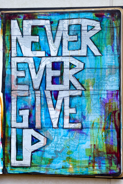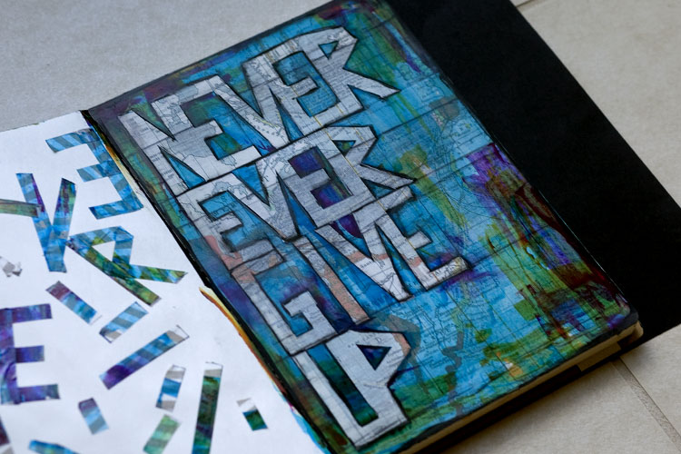
This week’s simple remember this was done for My Mind’s Eye. It was a page where I wrote never ever give up with washi tape. Then I painted the page, and then I stripped the washi and added some black marker. and ta-da!

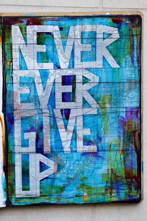
and here it is without the black marker:

which do you like more?
a lot more about this can be found on the My Mind’s Eye blog.
Remember This is a project for 2014. You can read more about it here.


I actually like it better without the black marker, but the outline does help it stand out more.
Love the message here!!!
Good example of: to each their own. 🙂 I like it better outlined in black marker, because it does stand out hence making it a stronger message which is oh so needed these days.
The simplicity (w/o marker) is just as beautiful. Love the colors and background!!!
Love the black….balances out the darker colors/black around the edges and reinforces the message. On the facing page you can use the letters (washi tape) to do a different background with same message or make a different message with the letters. Hmm…. Thank you for the inspiration again.
Prefer with black.
I really love this piece. Personally, I prefer it without the black, as I feel the letters provide more than sufficient contrast with the background without it.