This is a layout I made for My Mind’s Eye.
I wanted to tell you a little bit about how I came to make this page. In the middle of last year, I started making 6×12 pages just so try something new. I wasn’t sure if I would love it or loathe it, but I wanted to be willing to stretch.
As it turned out, I loved it. I loved it so much that I continued to make only 6x12s for the rest of the year.
After a few months, I had this idea of making two side by side 6×12 pages where one side would just be long journaling. I sat on this idea for months. I even mentioned it during one of the Paperclipping Roundtable episodes but even saying it out loud wasn’t enough to get me to do it. I just kept thinking about it.
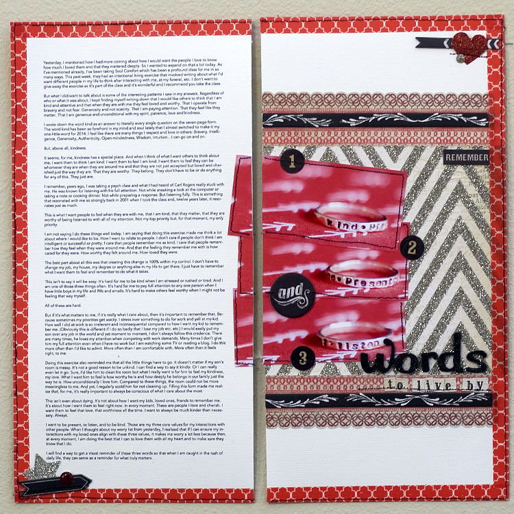
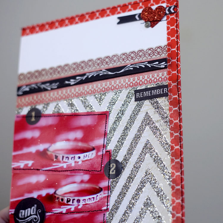
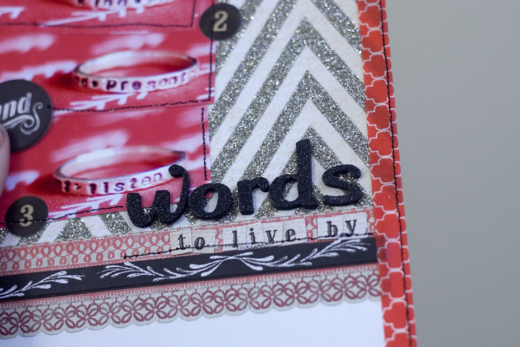
So when I sat down to make my first layout for 2014, I decided it was time. I wanted to try it out and see how it would look. I look a long blog post I wrote a while ago about how I would like to treat people and the kind of person I want to be. After I wrote it all out, I bought myself a ring with the words kind, present, listen. So I took photos of my ring and coupled it with my journaling.
And here’s what I ended up with:

Even though it’s made to go together, these are two separate 6×12 layout pages. I plan to store them in a 12×12 page protector and the fact that they will move in there doesn’t bother me. If it bothers you, you can tape them together or to a 12×12 piece of paper.
The nice thing about using a 6×12 page of journaling is that you can put it through a normal printer and do not need an oversized one. If you want to read the whole journaling, you can read it here
I mixed the beautiful new shimmering Lost and Found lines with the bold blacks of the Chalk Studio line and some enamel dots from Cupid’s Arrow.
If you haven’t seen the Lost and Found record it! lines in person, I cannot tell you how beautiful all the glittered papers are:

I created my layout such that the right side is a full layout that could stand on its own, so I gave it a title and all the finishing touches of a complete 6×12 layout.

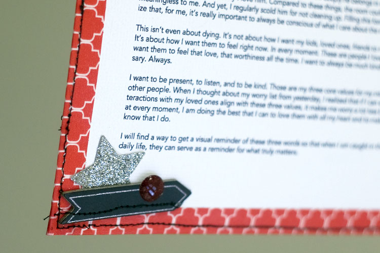
but then to make sure the two pages did work together, I made it so the photos spilled over a bit, I added the decorative tape border around the 12×12 area, and I added a glittered piece with a black chipboard piece and enamel dot on opposing ends of each page to frame it even more. A full round of stitching and my page was done.

I am so glad that after months of pondering it, I finally sat down and made this page. I love the asymmetry of the words on one side and the embellishments on the other. I love that I got to tell a long story and didn’t feel any pressure to write less. I would like to take the time and space to tell some longer stories and I love that this format allows me to do that without worrying about how I can make the design and journaling work together. It feels like I am not compromising on anything.


I am so inspired by this layout! Long journaling has been around for a while, but you’ve given a new spin to the idea with you right hand side that stands alone and blends so well with the left. Thank you.
I remember listening to that episode of PRT, and thinking what an interesting idea you had. So glad to see it come to life, I love the look of it. I think I would also love to see it in two 6×12 page protectors sewn together down the middle. It would be a fun surprise mixed in an album of mostly 12×12 layouts.