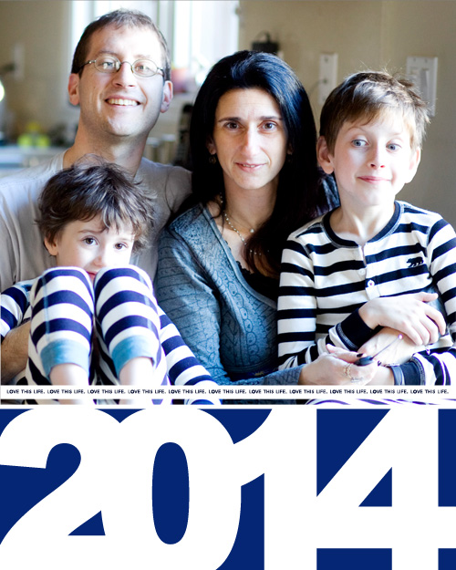
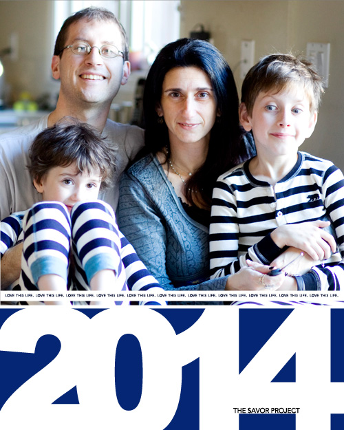
Just a little post today. I wanted to share my cover page. I am still working on the pages for the beginning of the year. As I take fewer photos right after the holidays, it’s partly figuring out how all that will work. For now, here’s my cover page:
I have three different ones, maybe you can help me choose.

or

or

any strong thoughts?
Savor Project is a project for 2014. You can read more about it here.


#3! #3! #3! 🙂
the last one – like the title in the year
Definately the first. But like them all.
The first one. Not sure why but I keep getting pulled to it.
I’m on Team Third One. 100 pc. 🙂
3, 1, 2. My order of preference. I like the prominence of the year and the title in it breaks up the white space just enough to draw the eye to it.
2 or 1 … 2 Makes a bold statement, 1 is elegant + subdued…what’s your core value?
I have be meaning to get back to you about that, Karen. There’ll be an email in your inbox soon.
Cheers,
Zewa
I like teh third one best
I love the 2nd one! The third one is good too if you want to have your small title there. lOVE the giant 2014!
I opt for the last one as well.I like the way 2014 works with The SavorProject text
The third one. That 2014 is great. Also like the blue better on 2 and 3.