I wanted to put some time into my Photoshop project this weekend, too.
So here’s what I’ve done so far:
Read all the David tutorials for this month as well as the prep ones: Digital Workflow:
all four parts, Creative
Workflow, Portraits: part
1, Masking: part
1, and Lanscapes:
creating dramatic skies
I will need to reread them again of course, but it was some good reading
for now. Here are a few lessons I learned in general (they’re all over
the place, mostly for me to remember):
- Always shoot RAW if you can. This gives you a lot more flexibility
in post-processing. This is something I knew but didn’t do often enough,
I’ll be playing with RAW this month, all month. - Don’t overexpose, you can’t get that information back. Don’t create
a right gap, you can’t get that detail back either. - When processing a RAW image, process conservatively so it gives you
the most flexibility when adjusting in Photoshop. - If you process RAW and then open as smart-object (shift-click the
Open Image button), you can go back and redo RAW processing if need.
(like to reduce noise) - Remember that the edges of an image can be a distraction. This of
where you’d like the viewers eye to focus and how you’d like it to
travel (this applies to layouts too.) - If you want to combine layers, selecting the entire image (Select ->
All), using the Copy Merged command (Edit -> Copy Merged), then the
Paste command. This is functionally equivalent to flattening the image. - If you want change the highlights but not saturation – try changing
the layer to “luminosity” for the curve adjustment.
So I wanted to put a little example of what magic masks can be. Be
forewarned that this is a quickie so it’s far far from ideal and the
original wasn’t RAW so that hurts the process, too. Not to mention I
over-saturated for effect. So with all that….
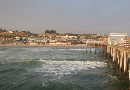
Here’s a photo I took last year in Pismo Beach:

As you can see it’s really flat so if I were to do some basic curves to
try to mess with the white point and some highlights and lowlights,
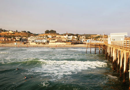
here’s what I get:

It makes the image a bit more full of contrast but now my sky is
completely blown out and you can see no detail at all. If I were to use
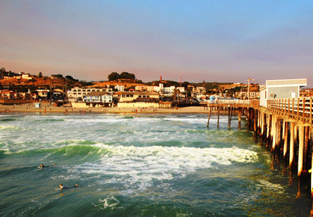
masks and do my saturation/curves using masks, here’s what I can accomplish:

Yes, it’s over-saturated, but look at the detail in the sky and the
detail in the sea. You can have your cake and eat it, too. More on masks
next week.


Leave a Reply