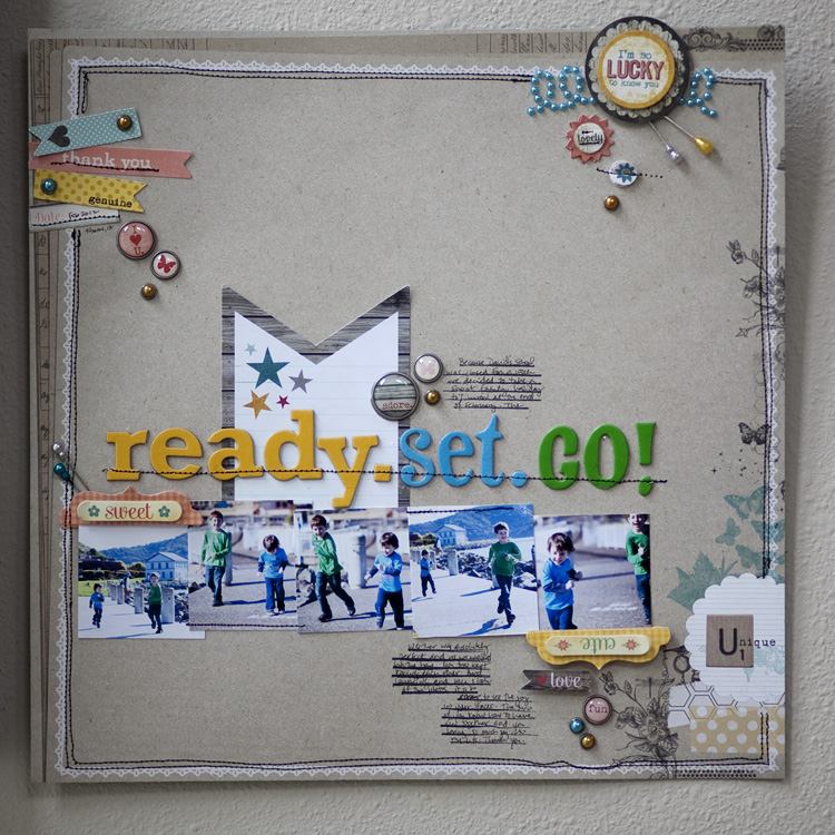
This is a layout I made for My Mind’s Eye for March.

And the journaling says:
Because David’s school was closed for a week we decided to take a short family holiday to Tiburon at the end of February. The weather was absolutely perfect and as we walked by the bay you two kept racing each other. And laughing and when I look at the photos it’s so easy to see the joy in your faces. The two of you know how to have fun together and you bring so much joy into my life. Thank you.
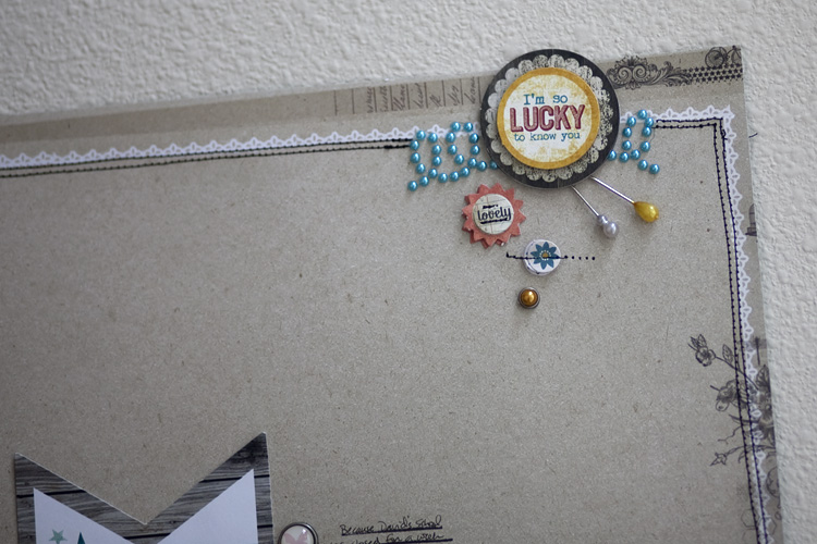
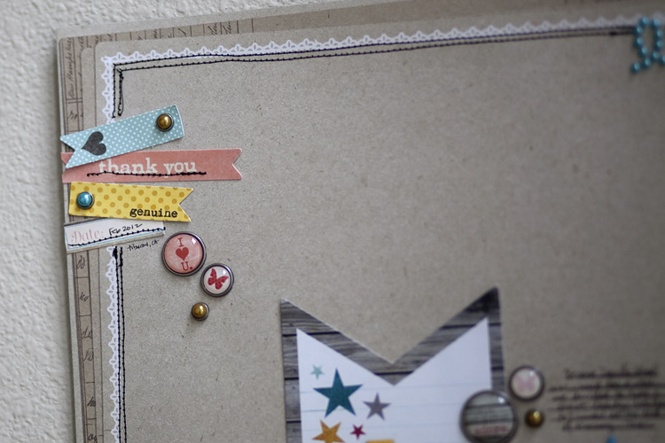
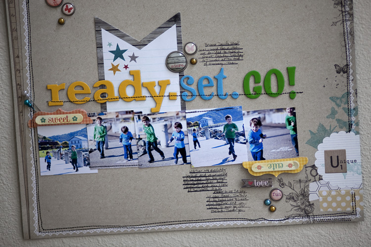
details:


Love this! Weird to see you do a non-white background but great for a change the photos really pop from it- makes me wonder if it would have looked as cool on white. How did you feel about not using white? It’s funny when we get into a habit changing it up can feel totally foreign and uncomfortable or really uplifting and liberating.
I love this page. Is your border stamped or is it lace? I love the mixture of the sewing in black and the white lace. It doesn’t look girlie at all. The netural background makes everything on the page stand out. If it is stamped what stamp company is it from? Thank you.
I also had to do a double-take at a non-white background layout from you! 😉 But I do know you depart from your standard fare once in a while, and as per usual this displays more of the beautiful, simple elegance that I love about your work. Thanks for sharing!
gorgeous layout!
WOW, LOVE LOVE THIS!! They are sooooo cute and happy!!