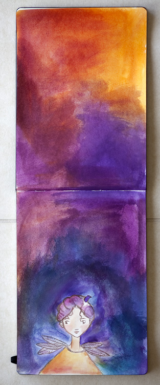
And finally we’re back to the normal 2-page spreads. This one was a vertical one and the girl is inspired by Abigail Halpin’s sketches. Here it is empty:
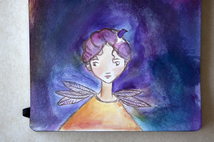
A closeup:
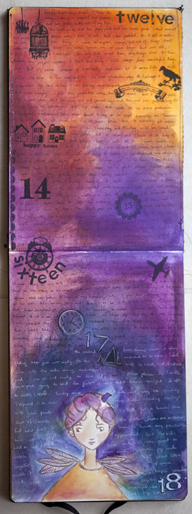
I just had fun filling this one:
here is the left:
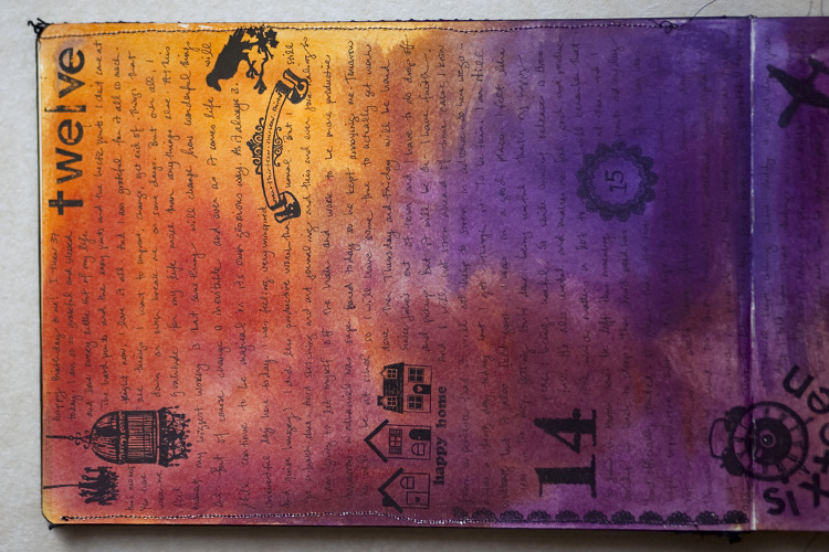
here is the right:
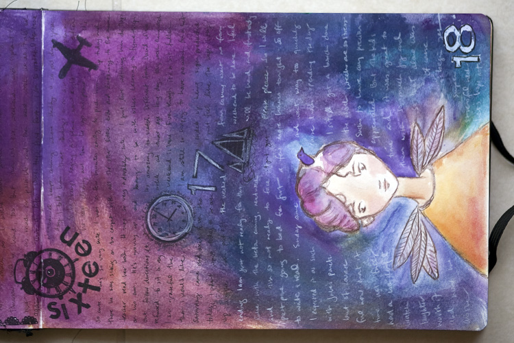
And here’s the filled page sideways:
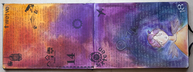
I used white text towards the bottom cause it was hard to see the black on the dark purple.
Weekly Art Journal is a weekly project for 2011. You can read more about it here. And you can find out more about the weeklong daily journaling here.


neat vertical spread. All of mine are horizontal! And I divide my pages in half, with lines, to make it area smaller. This is a great way of “halfing” the page.
love the colors of this one and what a nice change in the vertical.
how very cool. love it. outstanding colours!
Veritical spread looks really nice I like the colors as well.
Love the switch on format for a change and also the rich colors. Beautiful!
thank you 🙂