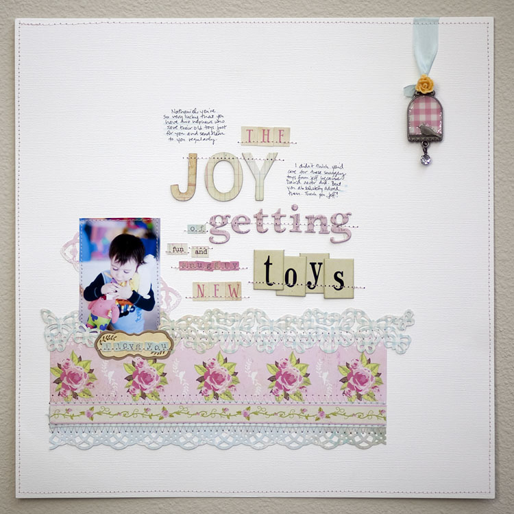
Now that CHA is passed, I wanted to share some of my The Girls’ Paperie work I made for the show.

Journaling Reads:
Nathaniel, you’re so very lucky that you have two nephews who save their old toys just for you and send them to you regularly. I didn’t think you’d care for those snuggly toys from Jeff because David never did. But you absolutely adored them. Thank you, Jeff!
All products are from The Girls’ Paperie Vintage Whimsy or Mix and Match lines.
Details:


Another lovely LO! Love the sweet photo.
So adorable! Love the title work!
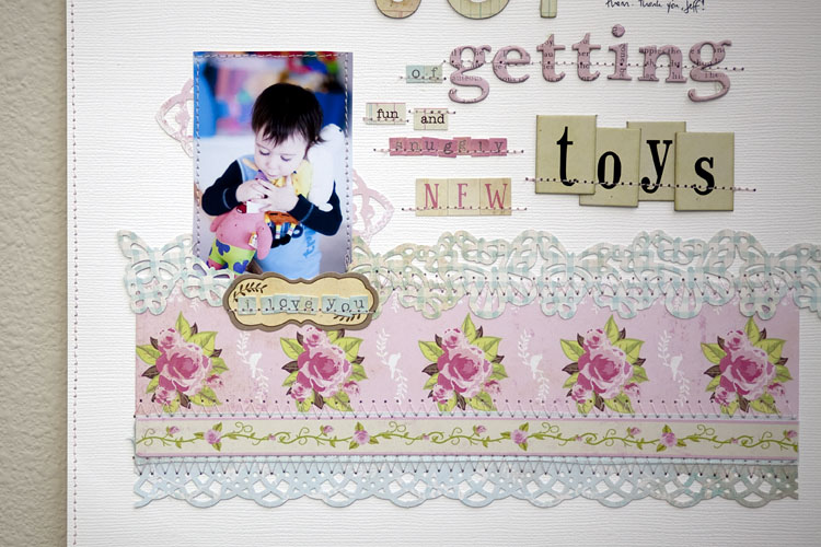
Luv this layout. I also love how you used butterflies and floral paper. One wouldn’t think to use on a layout for a boy. Beautiful!
I just wanted to say thanks for offering your embrace imperfection class at BPC. Were it not for this class, I don’t think I would have come across your fantastic website! I love everything I see! Thank you, Thank you!!
Love this lo! Love your class on BPC!
Please take this for the genuinely curious question it is, and truly that is what it is, not a critism, just a desire to learn.
An observation, generally speaking you seem to use small photos on a LO. (which by the way I do think are fab)
so why do you think that is, you take great photos yet they seem to take up such a relatively small amount of the page….
I do hope my question doesnt offend (and it seems strange asking it of someone I dont ‘know’ personally) but it is because I admire what you do and am interested in the thought process…
lol i am not offended at all! one of the things i discovered recently is that I like to use smaller photos. i generally like to use 2-4 photos. but even if it’s only one, i like it to be smaller than 4×6. not sure why. i think it’s cause it doesn’t feel overwhelming then. it’s another element of my page. i like the photos, words, and title to have almost equal value, i think. does that make any sense?
It does and it doesnt….again please bear with me as I explore this – from reading your blog I know how important both the ‘words’ and ‘pictures’ are to you, I guess (thinking this through some more) is that I can imagine a bigger photo = more story = less ‘white space’
so maybe my question is more about how you manage to rationalise the amount of white space.
again please this is an interested person asking a genuine question NOT a critism
lol don’t worry about it at all. i am not that easily offended 🙂 i love the white space. it makes everything work for me. so if the title and photos and word take up all of it, i feel like my page is suffocating. i like it to feel open and wide. some times i fill it up but it’s rare and i tend to like those layouts less. i already have the photos. for me, this is more about weaving the photos, titles, stories and the products+colors I love together.